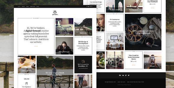
This unique template is a responsive and retina-ready HTML5 website with grid system layout. It is built with the new packery extension for isotope, which practically rearranges your tiles to fill empty spaces.
WordPress Version here
Joomla Version here
Features
- Valid HTML5 / CSS3 pages
- Perfectly responsive
- Retina-Ready
- Cross browser compatible – tested in IE 9,10,11; Firefox; Safari; Chrome and Opera.
- Well formatted and commented, so it should be easy to adapt and extend
- Website includes:
- Home
- About
- Team
- Filterable Portfolio (+ separate project page, slideshow page, video pages)
- Blog (+ separate Post Page)
- Contact
- Easy combination of blocks
- Working ajax contact form with validation and working PHP mailer script
- Retina-Ready Icons from demo plus additional ones (about 70) are included (if more are needed, 1640 vector icons can be purchased here: http://www.streamlineicons.com/)
- Custom print css stylesheet
- Documentation included
Updates
- July 2015 – initial release
- August 2015 – v1.1
– replace responsive-nav.js to fix subpage menu on mobile devices
Documentation / Support
An item documentation is included and the source code is properly commented and formatted, so you shouldn’t have any problem working with this item.
If you need support, please submit a ticket on our support forum (weibergmedia.ticksy.com). Please include the template name, website URL and detailed information about your problem. You can expect a response within 48 hours on weekdays, depending on the number of requests in queue.
Credtis
The Logo and all images are NOT included, but can be purchased. I will send you the links by email upon request.
