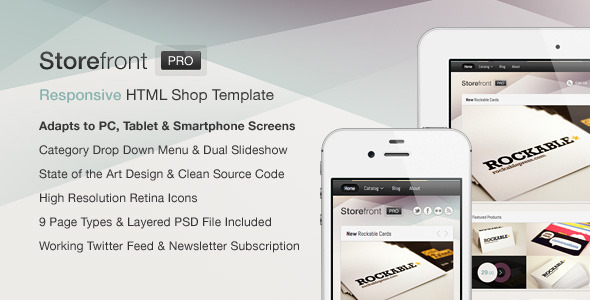
Storefront Pro is a Responsive HTML Shopping Cart Template written in HTML5 / CSS3 which provides a convenient way for your clients to buy your products at home or on the go and due to its clean source code and structure, it should be a breeze to integrate it into the e-commerce platform of your choice.
Also available as Shopify Theme with 100+ theme settings for just $25!
Please Note: If you’d like to preview the template on your smartphone or tablet, it might be required to close the black ThemeForest item preview frame on top first so it shows up accordingly.
- 9 Page Types
Nine different page types including the unique homepage layout, a category overview, product page, cart, search results as well as regular content pages have been prepared -- all of these look and work great on small devices and have been optimized for touch screen use. - M-Commerce Ready
Mobile E-Commerce or M-Commerce rapidly becomes more and more important these days. Storefront Pro should be a perfect addition to your existing e-commerce solution. Furthermore, any element your customers can interact with provides appropriate visual feedback which enriches the experience even further, especially on touch enabled devices. - Handcrafted Design
The clean, minimal and unobtrusive visual appearance has been designed focusing on simplicity and attention to details. Every element has been carefully crafted and positioned so it creates a professional and reliable impression which helps you to sell. - Quality Code
Storefront Pro has been written in clean HTML5 and CSS3 keeping todays best practices in mind in order to make sure it looks properly and loads quickly even on slower mobile internet connections. It makes use of the graceful degradation concept, which means that visitors who use a comparably new browser will be able to enjoy the design and the animations completely while it still looks good albeit not perfect using older browsers. - Customizable
The entire color scheme can be easily adjusted to your needs – detailed instructions how to do that included within an extensive documentation. - High Resolution Retina Display Icons
In order to ensure your business really shines on any device, high resolution retina icons and images have been implemented accordingly so it looks clear and sharp on devices like the iPhone 4 and 4s too. - Dual Product Slider
Two seamlessly implemented product slideshows save valuable screen real estate on the homepage and ensure that your most important products will be presented the way they should. - Category Drop Down Menu
A sleek, touch screen optimized product category drop down menu will make it easy to present all of your categories at a glance. - Working Twitter Feed
Just change the username and you’ll be able to show your latest tweets on any page immediately -- easy as that! - Newsletter Subscription Form
In order to make sure you’ll be able to connect with your customers, a perfectly integrated newsletter subscription form has been added. - Documentation & Support
A detailed documentation covering all aspects such as how the sliders work, how you can switch between different styles or what you’ll need to do in order to change the colors has been included for your convenience. If you should experience any problems or if you got questions in general, you can always send me an email and I’ll be glad to assist usually in between 24 and 48 hours.
Updates
- 01/11/2012 jQuery and Performance Update
