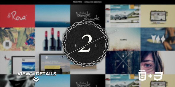
Folio Two is an advanced portfolio, a practical and usable template designed with HTML5 + CSS3 and using jQuery to enhance an awesome user experience.
This template is a powerful tool based on RESPONSIVE DESIGN, adaptive to any type of device. The screen size will not be a problem to show your favorite works. The gallery, for example, was developed exclusively for this template, will be adapted to display each work maximizing the visible space.
Also, if you are a DRIBBBLE fan you will can show through your portfolio your latest shots or configure it as you like more…players, followers, drafts…
Just select your best works and begins to show your talent!
Log:
- V1.31 // 01*17*2013
- Fixed bug with jQuery 1.9 for lightbox mode
- Fixed scroll bug with Safari iOS6
- V1.3 // 15*07*2012
- New gallery added and general improvements
- V1.2 // 02*02*2012
- Fixed Dribbble issues
- Improved mobile devices support
- iOS5 iPhone/iPod & Windows Phone 7.5 Mango ready
- V1.1 // 10*14*11
- Improved navigation
- New navigation mode for iOS devices (iOS5 Safari ready)
- New ajax contact form
- More semantic and valid lightbox code
- Fixed GMaps bug
- Add some minor improvements and graphics modifications
Features
- Dribbble integration
- Custom style Switcher – View style changes in “real time”
- Cool filtering method
- Custom galleries for showing your works
- Custom lightbox system
- Google fonts. You can use any font you want. In Help PDF is all explained
- Ajax Template
- 5 different nav/schemes skins
- Documented in code and PDF with “HOW TO…”
- FULL PSD INCLUDED
- Semantic HTML5 structure & Degrades Gracefully
- Smart Screen Optimized: 1920×1200 // 1920×1080 // 1650×1050 // 1440×900 // 1366×768 // 1280×1024 // 1208×800 // 1024×768 // 800×600 // And some smartphone screen sizes – For the rest of screen sizes the template will fit the space available in the best way thanks to media queries.
- iPad Friendly
- IMPORTANT NOTE: The images that illustrate this template make use of iPhones/iPad to show how the template is displayed on these devices from the point of view of responsive design. This does not mean that is 100% compatible, at least for now. As I said I am working to improve support for these devices
")
NOTE: Images used in this preview are copyrighted by its owner. Are only used as application examples, you cannot make use of them in no particular case.